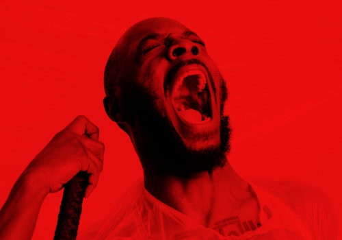
Meet the Irish Designer Behind Your Favourite Album Covers


Intro: Izzy Copestake
Interview: George Voronov
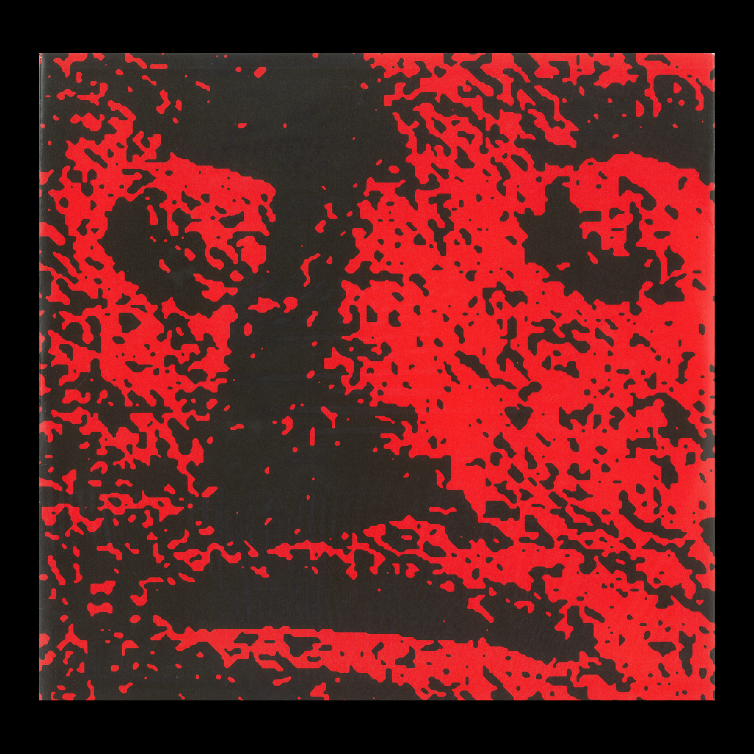
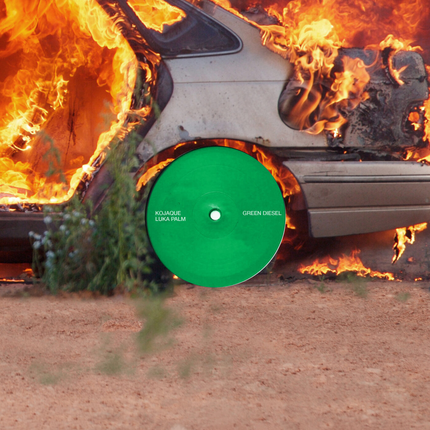
Even if you don’t know the name Oscar Torrans, you probably know his work. Torrans is an Irish graphic designer and creative director who has worked with some of the most exciting names in music right now, such as New Dad, Kojaque, and OXN. He also holds a special place in District’s heart – Oscar designed our first website, and referenced the visual language of cartography and navigation to create District’s compass logo.
Oscar also worked on the branding for this year’s Irish Design Week. Ahead of next week, we chatted to Torrans about his journey from designing posters for club-nights to becoming one of the most exciting names in Irish design right now. To get tickets for the myriad events running throughout next week you can visit the Irish Design Week website.
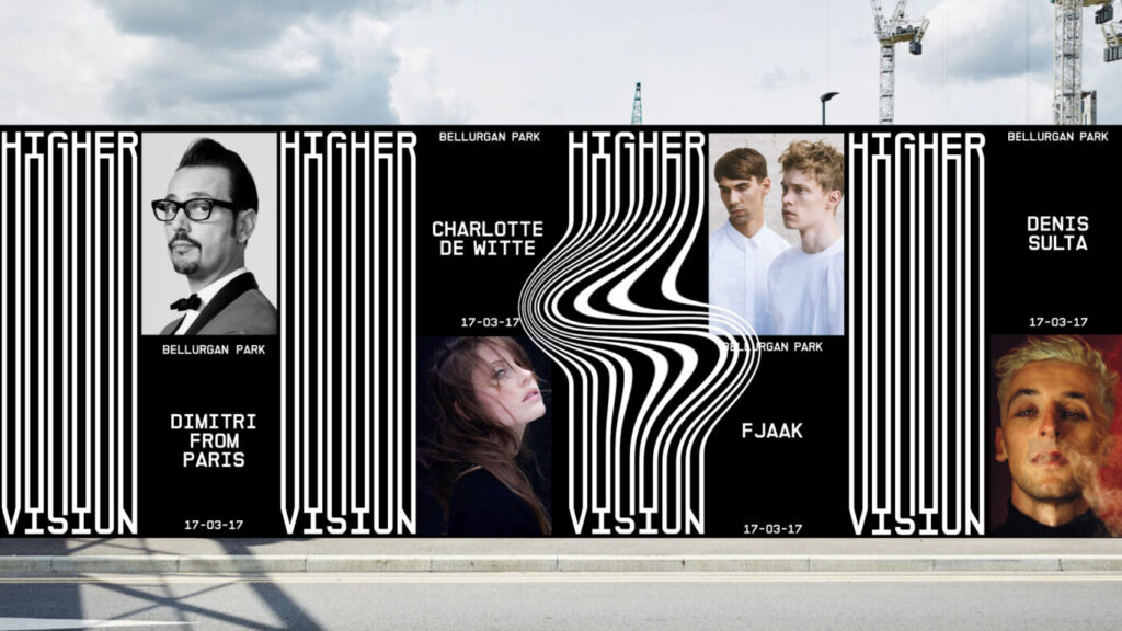
So my understanding is that you started working on nightclub posters and getting into design that way. I would love to hear a little bit more about that period of your life.
I got into, dance music probably around 15-16. Me and my friends were really into trance at the time and as we got a bit older, and I was in college, I was going out to Crawdaddy, Button Factory and Twisted Pepper pretty much every weekend.
I met a lot of people with similar interests. And I think the club scene is really good when you’re young with its DIY approach to everything. You meet DJs, sound engineers, photographers, promoters etc. which makes for a really good community.
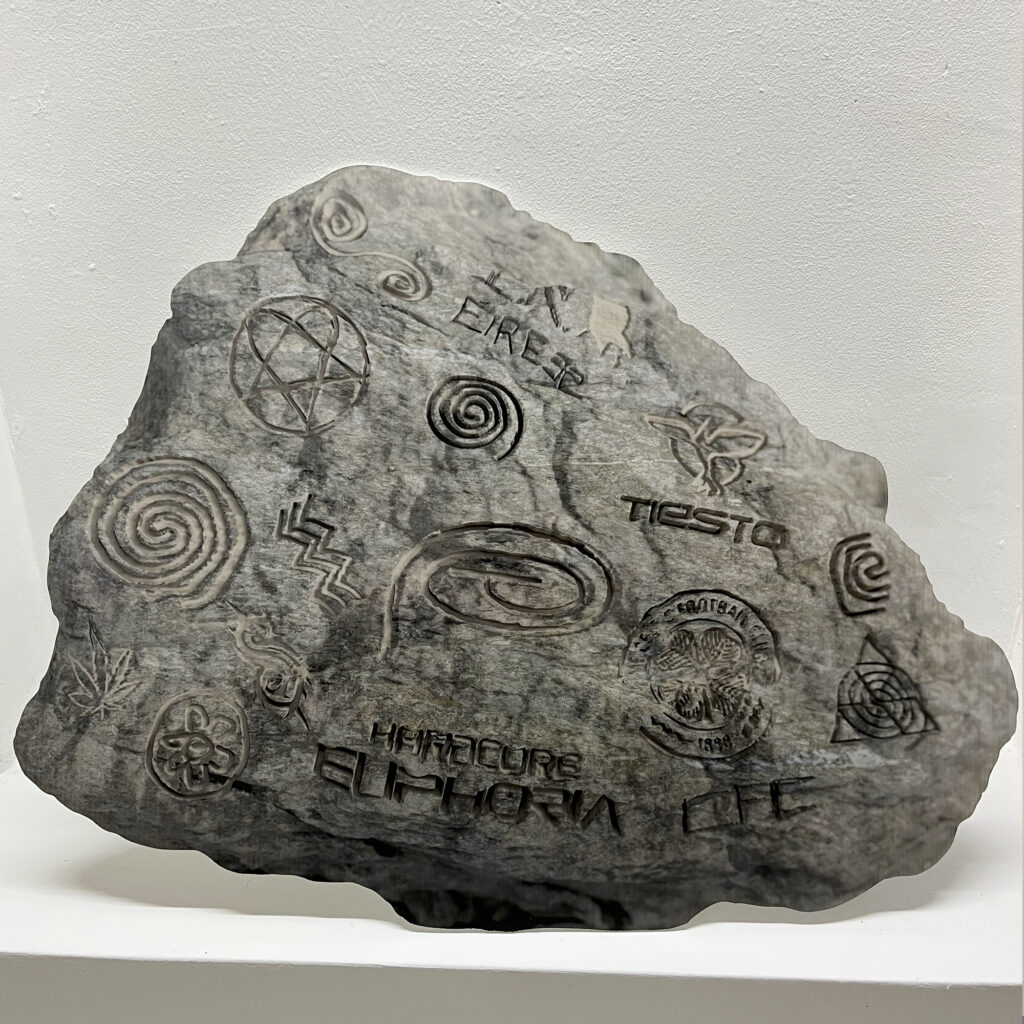
Do you remember any specific design projects that really inspired you to go down the route of graphic design professionally?
I wasn’t too aware of what graphic design was until I was already in college studying it. I think I always loved it but I didn’t know that it had a name. I was in bands as a teen (mostly ripping off Korn), and even at that point I was more focused on the artwork and the logos than the songs. It didn’t dawn on me that it was a job till many years later.
Bits that stick out to me are work by Ed Templeton and Chocolate Skateboards. French graffiti artist Horfee, works of Barry McGee and the album covers of acts like Slipknot, System of a Down, Busta Rhymes, and Rage Against the Machine.
I was also pretty good at drawing on peoples’ Bebo walls…
So then tell me about finishing college and making that leap to start a career in design.
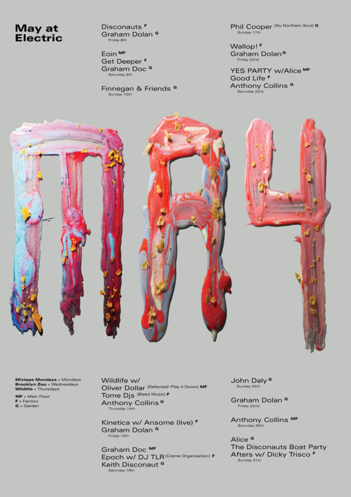
When I graduated, it was 2012, mid-recession and we couldn’t get a job anywhere. I bumped into Craig (one of the founders of District) one day and he needed a poster for something. They were getting involved in Life Festival at the time as well as managing four club-nights a week. So all of a sudden there was a lot of design work coming in.
I ended up working full time in there which was a really good time. I think if I had gotten a job in a design studio, I would have been an intern with no freedom to do anything and no creative control.
But being in that position, I learned a lot more practical skills. And you learn how to deal with people, how to make work at a quicker pace than you used to in college. And at that time, the clubbing scene was really booming. I was a big nerd about the music so I would listen to the music and then translate it into artwork.

You said, you would listen to music and translate it into design. Can you elaborate a little bit about what that process was actually like?
I think in the early days when I was making those posters, I didn’t have much else to do, other than whatever that poster was at the time. I was living in my parents house so I could just listen to whatever dark techno tracks over and over again and then attempt to translate that audio and the mood of that song into the visual of what that song felt like and what I thought it represented.
I found the limitations of the software so I started getting physical with making things. I would end up like mixing bleach and shoe polish together and putting it on, like an old piece of wood and photographing it.
The idea was that the physical process would kind of capture the sludgyness of certain tracks for example. I embraced that complete DIY approach. I was just trying to bring in as many of these different elements together to create something.
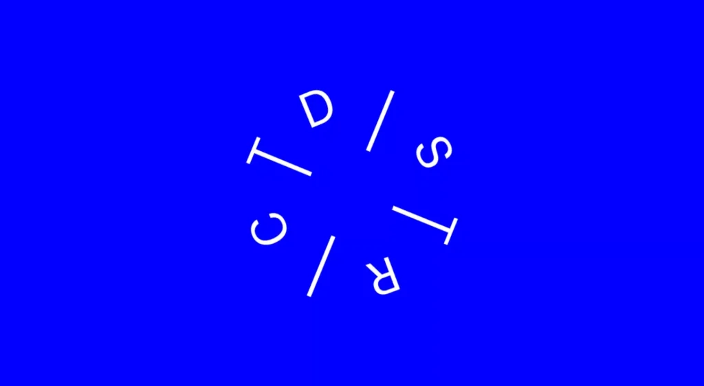
You also designed the original District compass logo and our first website. I feel that happened right before I met Craig and Eric [who set up District] so talk me through the story.
Yeah, well, I knew Craig and Eric from the club days. They were running nights that I was doing work for. Eric had started a blog as a way to kind of move out of the club and get into journalism. Craig saw that as a good project to invest in and try make it better. Back then I think it was on, like, a Blogspot and the guys asked me and Simon Sweeney if we would do a branding job for them.
Myself and Simon were just starting out on our own, so we were really excited to get a job that we could build into something: a full identity and a website. I think we had the idea [for the compass logo], because their original idea was for the website to be focused just within Dublin, and they wanted to cover what was going on in the various different areas of the city so we had the idea of getting into cartography.
We used that idea of a map as a backdrop for the website and we had these ideas like, “oh, you know, if it’s a map, then the logo could be a compass”. And I think I did, like a very rough version in a much fatter font. That kind of got the idea together and then Simon did it in its final version, in a much nicer, laid out way. And we were just like, “Fuck yes, that works”.
I think I was maybe 24 when we were working on that project and, you know, it’s one of the few things I still have on my website from that period.
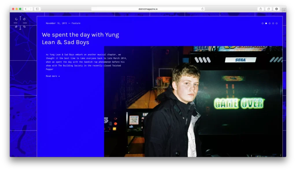
I remember in those very early days when District were trying to book acts to interview, management might have been like “Who are these Irish guys?” And then you sent them to the website, and they were like, “Oh, well, okay, all right.” I think it definitely helped get us in the door for a good few of those features.
Yeah, and I remember we got selected to be put in the 100 Archive which was really sick. Because, again, we were like, “oh, wait, are we real designers now?” It was a kind of affirmation. Being able to get those opportunities at that time was great, because it was difficult enough to just get a job even at a lower level in a design studio and, even then, you definitely wouldn’t get an opportunity to develop things yourself as much at that age.
But it was that project, along with maybe a few others that helped me get those studio jobs down the line.

In fairness, massive kudos to you and and Simon for actually taking that responsibility on and delivering something that stood the test of time. Part of the reason why that type of work tends to be given to more senior people is because they’re responsible hands. So you guys really rose to the occasion.
You know, when you’re younger, you might look at something like, the identity for something like Travis Scott’s World Tour for example and think, “oh, yeah, with all that money, I would do a real sick job”. But really it’s about treating every job like it’s the most important thing and doing it to the highest standard.
You could be like a young designer doing a poster for your mate’s rap show but it doesn’t matter who that’s for, it’s what the final piece is like when it’s in your portfolio. Putting in that effort regardless of the status of your client will pay dividends.
Because you never know where it’s going to end up, right?
I think that’s such an important lesson regardless of your field. Whether you’re a designer or a photographer or whatever. The work you make is the work you get. And that’s fully true.

Following on from that, we’re talking in the context of the lead-up to Irish Design Week. You did the branding for this year’s edition. Obviously, it’s a pretty big honour to be asked to do the branding for the national celebration of design. What was that like?
I met Tom, who’s the Head of Design at DCCI, and he’s bringing a lot of fresh, new energy and really amplifying Design Week and making it more engaging for young people.
When they first got in touch with me I didn’t think that Irish Design Week would be something that they would want me for. I thought that my work would be seen as too weird or something. But I can see that they’re very keen on making something interesting and new and I was really honoured to be asked.
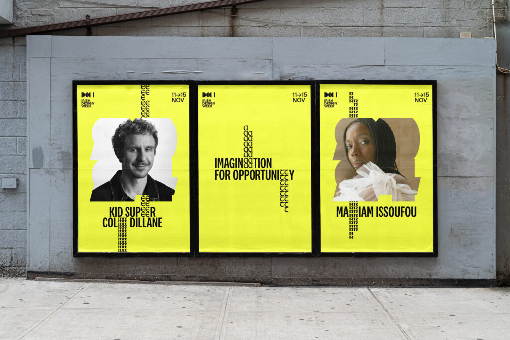
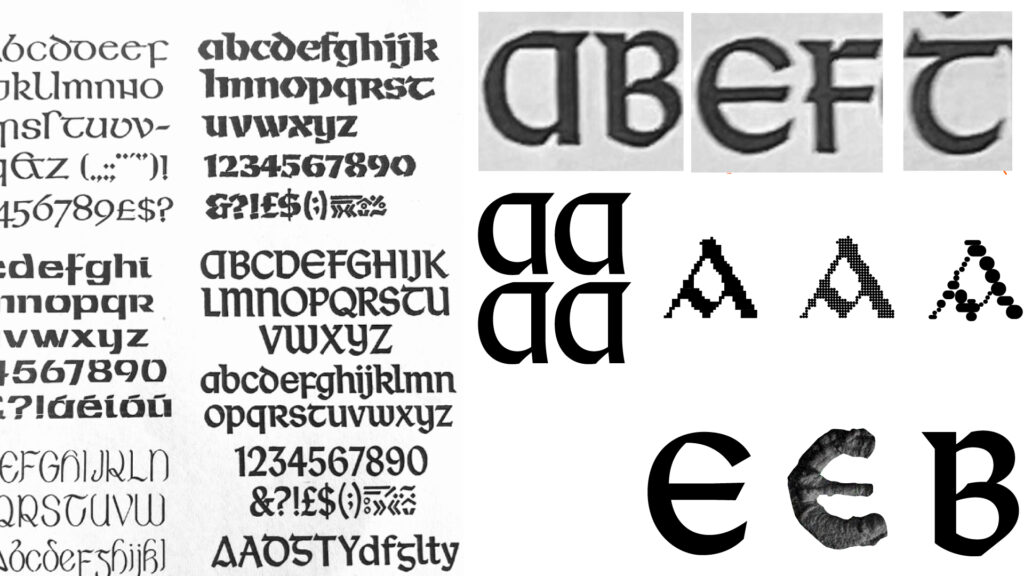
Their ideas were quite interesting. They work out of the old Kilkenny Design Workshops, which were a real centre for design in Ireland in the 60s through to the 80s, and a lot of great work came from there. They took me through their archive and in particular, there was an Irish typeface competition from the 70s that had examples of alphabets done in historic Irish characters. They wanted to work with them but not having it look overly traditional, you know, like the front of a pub or something. The solution was to use some of the letters with a more modern face and then to use them in slightly unexpected ways. A lot of the speakers at Irish Design Week are challenging contemporary issues such as climate in interesting and creative ways and I wanted to reflect that in the identity.
In terms of the mission of Irish Design Week, what do you think Ireland needs in order to become seen as a design hub on a global scale?
I think having international involvement in events like Irish Design Week is crucial. Even thinking back to events like Offset, they were so valuable for bringing international people in and having Irish speakers on the same stage as well known names from around the world.
But design will also always reflect the state of the country. If you’re a studio that specialises in restaurant branding, it’s going to be difficult for you to succeed if nobody’s opening any restaurants.
In certain other countries it’s a lot easier to get funding for design related projects.You know, when the Kilkenny Design Workshops were set up, it was seen by our government at the time, as an integral thing that should be a priority for our society.
You see how some Scandinavian countries or the Netherlands really prioritise design on a cultural level. With the extensive history of craft that we have here, all it needs is more funding and attention from the government. The talent is already here and the great work is already being done.
Who are you most excited to check out at Irish Design Week and Why?
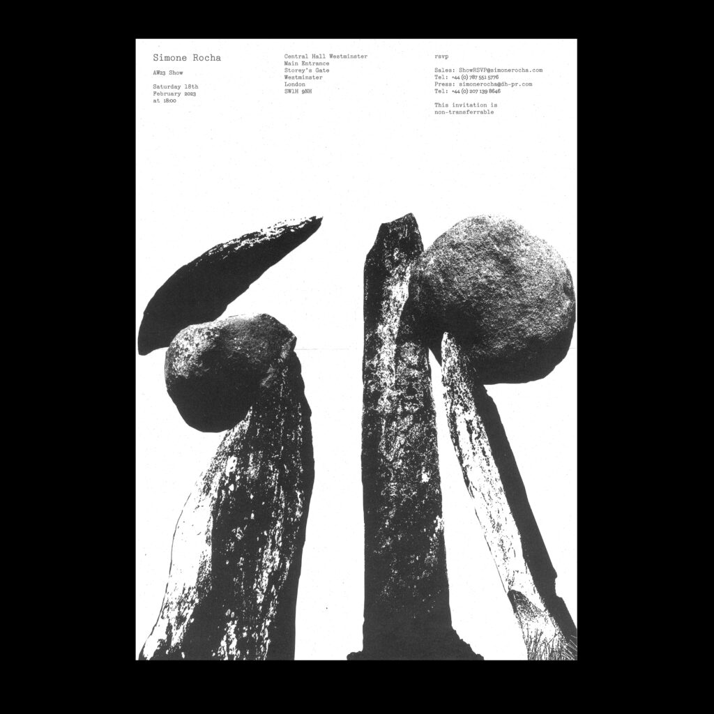
Looking forward to Mariam Issoufou, Kid Super, and MacGuffin Magazine. All their work is really interesting. It will be interesting to hear about Kid Super’s Irish roots. I’d love to know more about Mariam Issoufou’s projects and their approach to sustainable architecture.

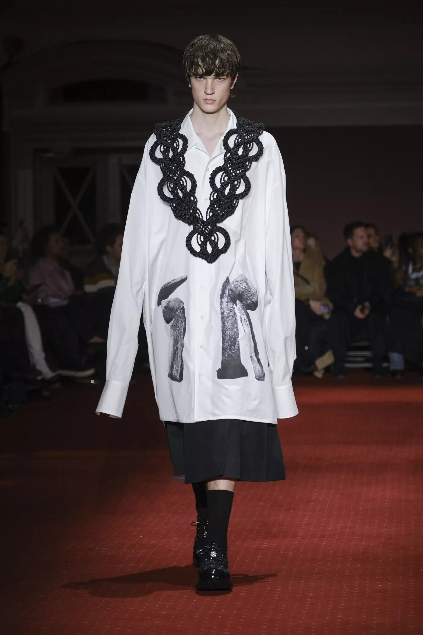
5 of your own favourite design projects?
I’ve got four:

3 Irish Designers people should follow?
I’ve got four again:
To check out the full lineup for Irish Design Week, plan your week, and avoid missing out on tickets visit Irish Design Week’s website.
