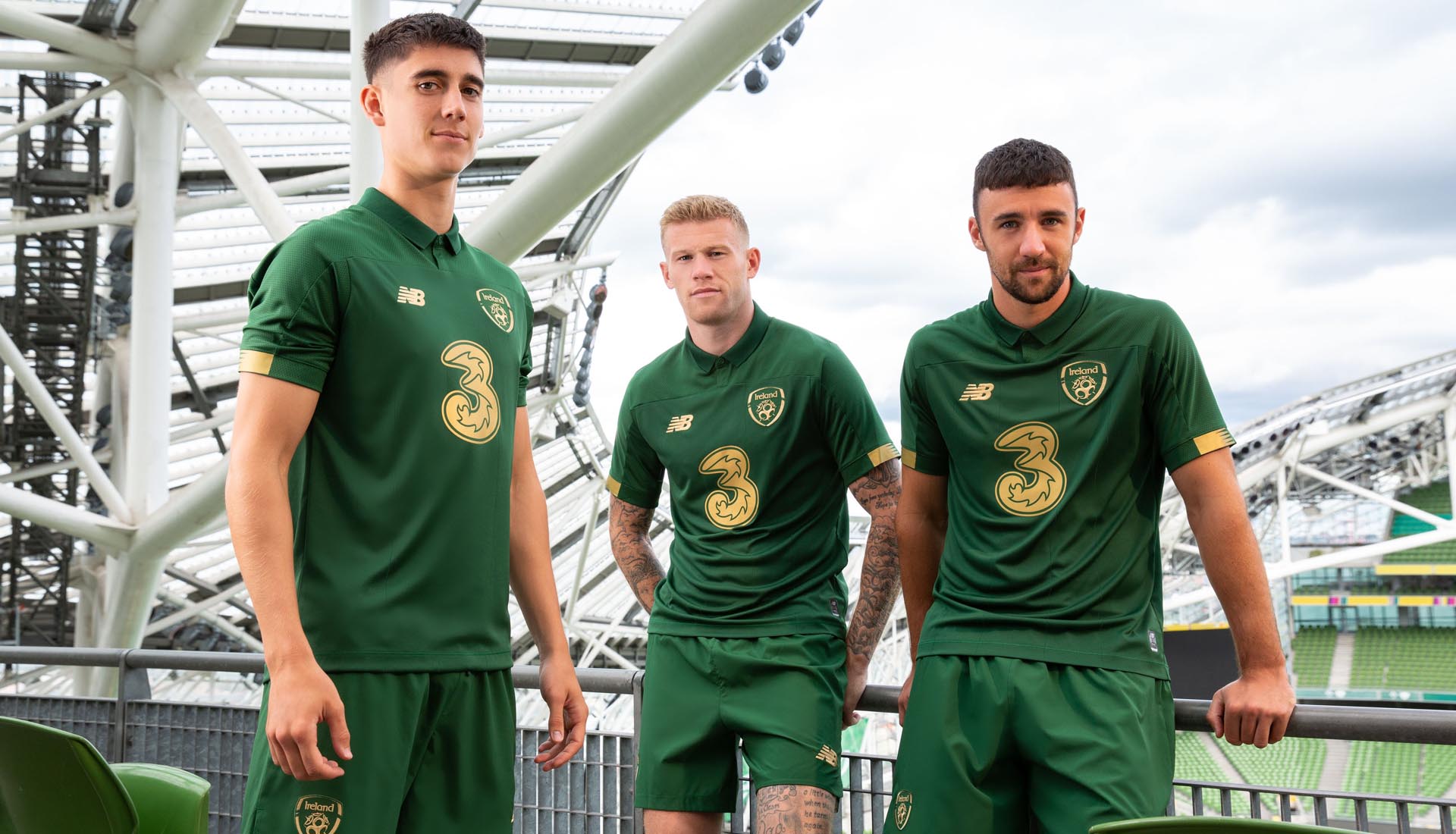
The 10 Worst Irish Football Jerseys
Words: Dylan Murphy
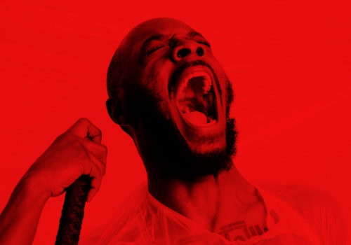
Photo: Roy Keane by James Meehan
Words: Dylan Murphy
Photo: Roy Keane by James Meehan
For sure, the national team has served some serious jerseys in the past 20 years, but for every Adidas classic there’s been some big misses. Presenting, a completely scientific review of the 10 worst Irish football jerseys.
Unless you’ve been living under a rock, you’ll no doubt have been exposed to the discourse around the new Ireland jersey. The contentious Castore sponsored shirt came under close scrutiny during the game against France last night and raised questions over whether it’s the worst home shirt of all time. With that in mind, we had to deep dive into the archives and revisit some of the shirts that not even blokecore TikTok would touch.
A quick glance showcases that anything before 1995 is near untouchable. Adidas had the shirt game on lock. Since then, it’s been questionable, but we’ve stuck our heads together to draw up a list of the 10 worst modern outfield shirts. No goalkeeper shirts, nothing before 86 and no training tops. Here’s the 10 worst Irish football jerseys
2016 Away

You remember how you have to create a kit for your team on fantasy football every year? 2016’s away is the FAI lifting the design from theirs and phoning it in.
1995 Away
It’s contentious, but we’re sticking to our guns. ’95 Away is not the one.
2020 Home
New Balance had a disappointing tenure with the national team. It’s strange that a brand with such a strong standing in the world of street wear has been known to miss the mark in sports design. This one is no bueno.
Credit: New Balance
2008 Home
The positioning of the Umbro logo, the feathering on a grim number font, the distracting shade and positioning of the orange. That’s before we even start on the fit of the shirt itself. It’s neither slim and sporty or oversized and memorable. It’s just caught in the middle of competing ideas.
2016 Home

Mid. There’s nothing that stands out as being particularly awful, but this piece is the sum of its parts and everything about it is painfully inoffensive.
Credit: PA Sport
2011 Home
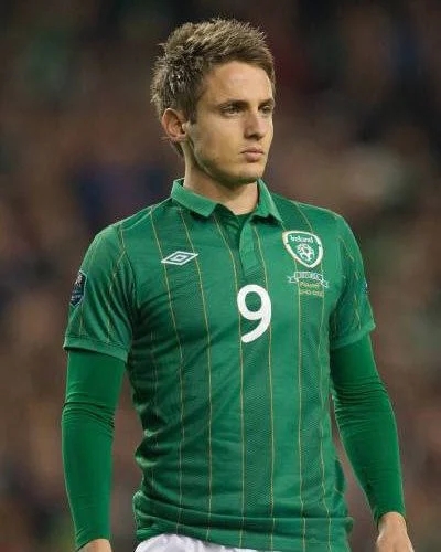
In recent years, collars have been enlisted to bring a classic feel to modern kits, but the 2011 jersey has aged like brostep and is more Topman than Levis. Not to mention the gold that makes it look like if Quality Street dropped its own capsule.
Credit: sportfotodienst
2018 Home

It’s synthetic-looking material for me. I just can’t look past it.
Credit: Stephen McCarthy
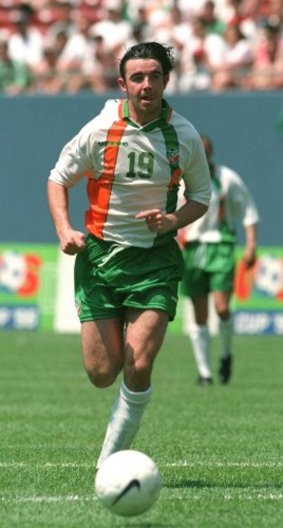
1996 Away
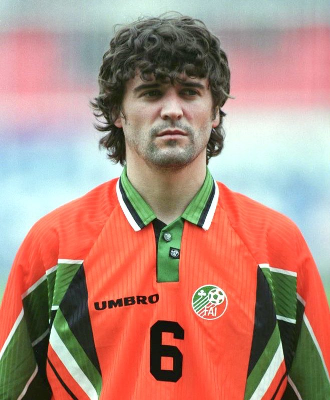
Shape, collar, numbering and a font in favour of the Umbro logo, this shirt has the ingredients for a classic, but you just can’t get away from that completely invasive orange.
2021 Away
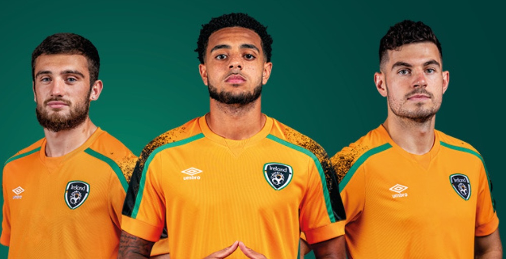
It appears imagination peaked at the Microsoft paint spray can tool on the sleeves of a training top in 2021.
Credit: FAI
2023 Home
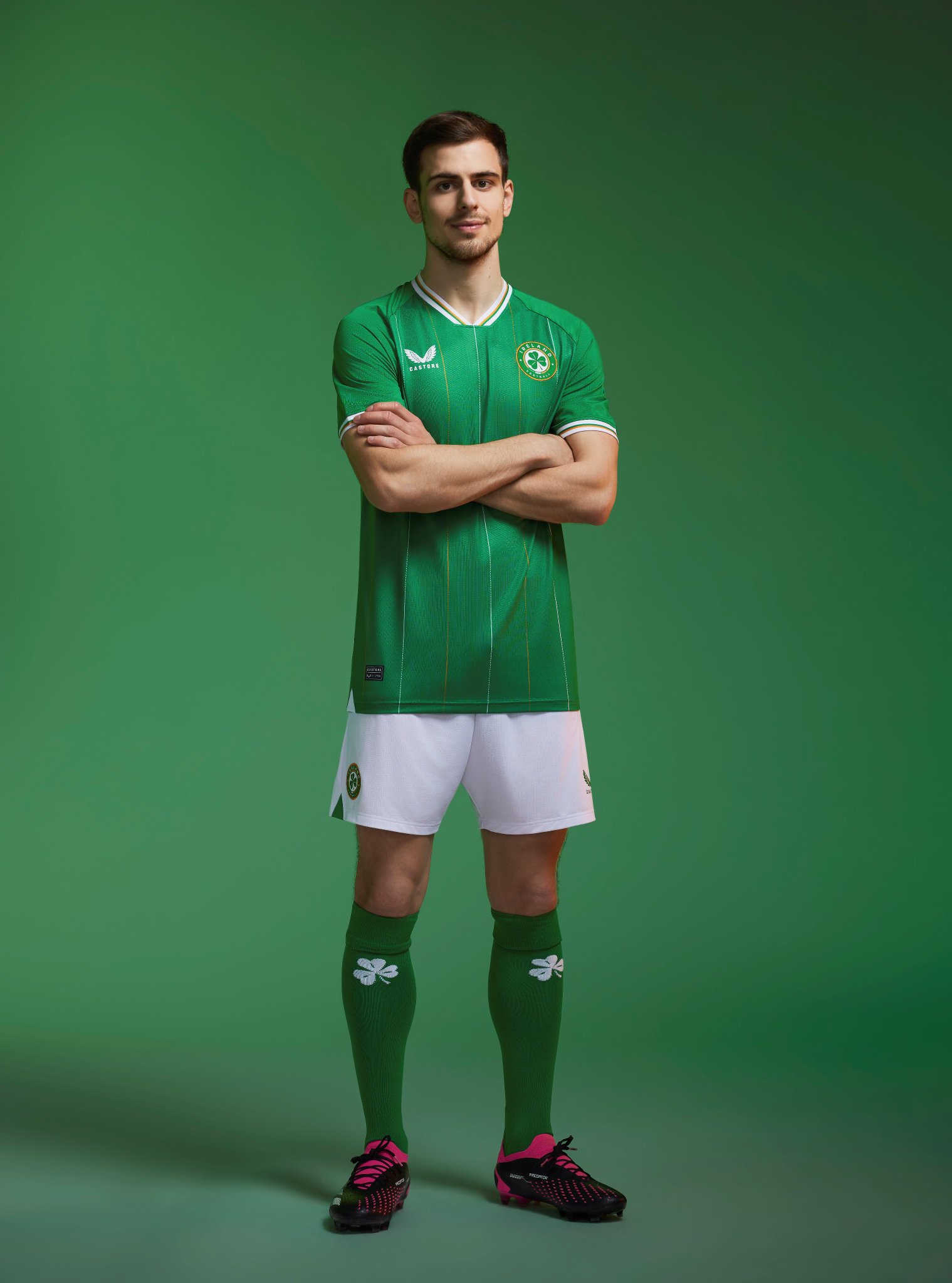
Credit: Castore
You know on Pro Evolution Soccer when they don’t have the rights for a club so they call them the Merseyside Reds or West London Blue? This is the football shirt equivalent.